


LOGO
The logo is formed with a combination of planets and space elements with the key art which is hands popping out of it in a sense of reaching out. The name “FAR OUT FESTIVAL” the hands are the main art as to show the effect of reaching out. The colour purple is used the most as a cartoonish galaxy since it is space and orange is used to throw some pop-up effects. The pastel peach looking colour is used to differentiate the arts that are being used which is the hand and planets. White for the festival title as a bright art and navy blue for the lines just to match the orange and purple. The spacing among the arts are tight but it is also combined with open spacing all around it. The lines are organic to portray the hand-drawn image of its own.
POSTER
The poster is created with the title as a focal point alongside with the key art and other elements such as blinking stars, astronaut and some extra planets. The title is shown clearly with a bright and bold typography as the main thing in the poster. Also, the other graphics are added in to portray its own importance as well but just with a smaller size and different placing which is at the sides where else the title is placed in the middle. That idea is to show the importance of the elements in the poster. The colour of the graphics is slightly off on the astronaut because it did not follow the colour palate that is provided for the designs. The lines are same as the key art which is organic lines and the spacing given is not too tight and too free as well. It is combined and balanced.
WAY FINDING
The way finding is created with the artist names as a focal point by bolding it with some colour pops included. Although the names are not set bigger than the other details, we think with the colour pops it will be a better attraction and something that will be focused compared to other details. Then comes the title which is something important for the festival and it is stated big enough to show its importance followed by the date and time below it. The colours are used according to the colour palate and the lines that are used is geometrical and bold.
FESTIVAL ADVERTISEMENT
The festival advertisement is created with the title as the main focal point to promote the festival, but it also focuses on the artist names as well. The title is bolded and stated brightly to show the name of the festival and the artist names are also stated brightly but not bolded just to show the difference in importance. The key art which is the logo of the festival is added as an element to portray the theme. The advertisement spacing is messy but well placed at the same time to catch attention and to portray the vibes of the festival. The colours are all same as in all the arts. The lines are mixed with organic lines which is the hand-drawn graphics and geometrical for the boxes.
TICKET
The ticket has the key art which the hand as the focal point with the colours included to match the theme of the festival. It is also placed huge to get the attention needed. The ticket is followed by the details of the festival which is the title, date, ticket class and barcode scan ID. In this part the title is bolded to create an identity name as a brand for the festival and followed by the date on top of it to mark the important detail for the festival. Below it is the ticket class and barcode for something to be aware of just as a reminder to recognize, The colours are as the same as all arts and the lines used are bold and organic as to portray the character of the festival.
DIRECTION BOARD
The direction board is created with the hands as the focal point which is pointing out the sides to show direction of the particular place. The places that are being pointed is stated in bold to be noticed but is still smaller than the hand to let the key art which is the hand to communicate itself better than words. Organic lined planets are also included as a supporting graphic to fulfil the spaces and make it look more attractive and not too spacy. Colour of the hand is the orange so that it is bright and gets attention quicker in public. All the graphics are designed with the colour palates provided.
SIDE BAG
The side is created as a merchandise, so it is more focused on the festival identity which is the logo. The logo is placed in the middle in a big size to portray the identity which is important for a festival’s merchandise. The title comes along with the logo and shows as much importance as the logo do. The colour purple is used mainly as the theme of the festival itself. Organic lines from the logo. Graphic art is placed in the middle with a free space around it to keep it simple and casual.
T-SHIRT
The t-shirt is designed similar to the side bag with the logo as the focal point followed by the title that comes along with the logo and everything is placed in the middle. The colour purple is used following the theme of the festival. Organic lines from the logo and designed to be simple and casual.
STAGE
The stage is designed with the astronaut floor for the artist performance as the focal point. It is placed in the middle to be the centre of attraction. At the back of the performance floor, there is a huge board placed with the title and the logo for the festival. That is just to address the festival and to catch attention or to be recognized in live and social media. The title is placed side on side on the board to fill the space and set the be sized huge to show and state the name of it clearly and bold. The performance floor is the most important element in this design and followed by the logo with the tile. The colours are all according the theme and colour palate. The lines are organic on the logo and geometrical on the astronaut with some curved lines as well.
BADGES
The badges were designed to show the characteristic of the performance stage which focusses on the astronaut as the main graphic design. Few designs created with same graphic but different colour option from the theme and colour palate for the festival. The title and the key art which is the hands are included as the identity of the festival and placed around the astronaut. Lines are geometrical and curved. The astronaut is placed in the middle since its more important for the design.
WEBSITE
The main part for the website is designed with the title and logo as a focal point since that is the main identity of the festival. The main page also provides some details such as the date and time. The title is placed high with bright and bold words to be the main element to get noticed and the date with time is stated smaller compared to the title and placed at the bottom corner as a deatil to be noticed as well. Its designed in a darker colour.
The second part of the website is designed to be simple for a comfortable control to the users. Its is a ticket purchasing page that displays the classes and categories of the tickets. The word “Tickets” is placed on top as an important detail to address the page and the items offered. The ticket are given names to be addressed as according to the category and followed by the prices. Every ticket category is displayed with the festival logo to portray the identity of the festival. The category names are bolded as an important detail and the prices are stated along side as a detail to be noticed. Colours are all followed according to the colour palate and lines are all geometrical.
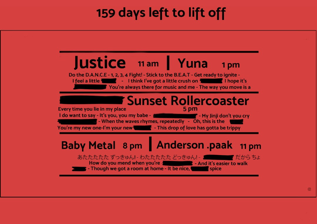
The third part of the website is to show the artists involved and that is made as the focal point of it. The artist’s names are stated huge and bold and followed by the time of performance in smaller size just to show the importance of the details. Artist lyrical work is also added as a design detail to give the artist an identity. Lines are all straight and the bright striking colour is used to catch attention.
INSTAGRAM
The Instagram posts are designed with the artist as the focal point mainly but it is also well balanced with the logo and title as the identity of the festival. The artists are placed on the logo just to show the character involved with the identity of the festival together. The title comes with the logo and which is designed to be bright and bold as an important element to address the identity if the festival. The logo with the title is placed in the middle to be the centre of attraction and artists image on it as a combination of fade effect and opaque as well. The lines used are organic on the logo, geometrical and realistic on the artist and the layout. Colours are all according to the colour palate and theme.


